
Insert Button in Odoo 17 Dialog Box
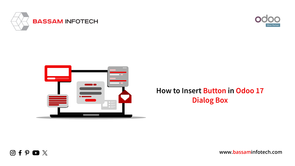
In this blog post, we’ll review how to add a button to an Odoo 17 dialog box. When a button is pressed or a field, like a confirmation dialog, an alert dialog, or a warning dialog, is changed, a dialog box—a little window—is displayed on the current window. It may also resemble pop-ups or modals. Dialogs are typically utilized in the backend of websites.
Here, we’ll talk about adding buttons to various dialogs, such as AlertDialogs, Warning Dialogs, and ConfirmationDialogs, which ask for confirmation.
Confirmation
The web.ConfirmationDialog is utilized to present the user with a brief message. The OK and Cancel buttons are the two buttons on the web—confirmation dialog. Thus, there are two ways for us to end the conversation either by selecting the Cancel button or the button with the X icon. Therefore, the template expands the site to add a new button. Part of the Confirmation Dialog It adds buttons on top of already-existing buttons, with props controlling the button’s class and label dynamically. The method is tied to the button’s click event.
<?xml version="1.0" encoding="UTF-8" ?>

 <templates>

   <t t-name="advanced_many2many_tags.SaveFormDialog"

      t-inherit="web.ConfirmationDialog" t-inherit-mode="extension">

       <xpath expr="//button[hasclass('btn')]" position="after">

           <button class="btn btn-secondary"

                   t-att-class="props.open_form_viewClass"

                   t-on-click="_open_form_view">Open form View

           </button>

       </xpath>

   </t>

 </templates>
The ConfirmationDialog component’s behavior is extended by the code by importing different modules and components required for the patch function.
/** @odoo-module */

 import { Dialog } from "@web/core/dialog/dialog";

 import { _t, _lt } from "@web/core/l10n/translation";

 import { ConfirmationDialog } from "@web/core/confirmation_dialog/confirmation_dialog";

 import { patch } from "@web/core/utils/patch";

 import { useService } from "@web/core/utils/hooks";
Include the button’s functionality.
  patch(ConfirmationDialog.prototype, {

   setup() {

       super.setup();

       this.action = useService("action");

       },

         _open_form_view(ev) {

   return this.props.close();

   },

       });
This line of code defines the ConfirmationDialog component. along with extra and standard props.
  ConfirmationDialog.props = {

   ...ConfirmationDialog.props,

   open_form_viewClass: { type: String, optional: true },

   open_form_view: { type: Function, optional: true },

   open_form_viewLabel: { type: String, optional: true },

   recordResId: {type: Number, optional: true}

 };

 ConfirmationDialog.defaultProps = {

 ...ConfirmationDialog.defaultProps,

   open_form_viewLabel: _t("Open Form View"),

   open_form_viewClass: "btn-primary",
The message and confirmation dialog is shown here, and the additional button is visible next to the other buttons.

Similarly, we can add buttons inside Odoo and different dialogs like Warning Dialogs and AlertDialogs using the same method within the website.
"Unlock the Full Potential of Your Business with Odoo ERP!"
"Get a Cost Estimate for Your ERP Project, Absolutely FREE!"
Get a Free Quote
