Odoo 17 Sales Report
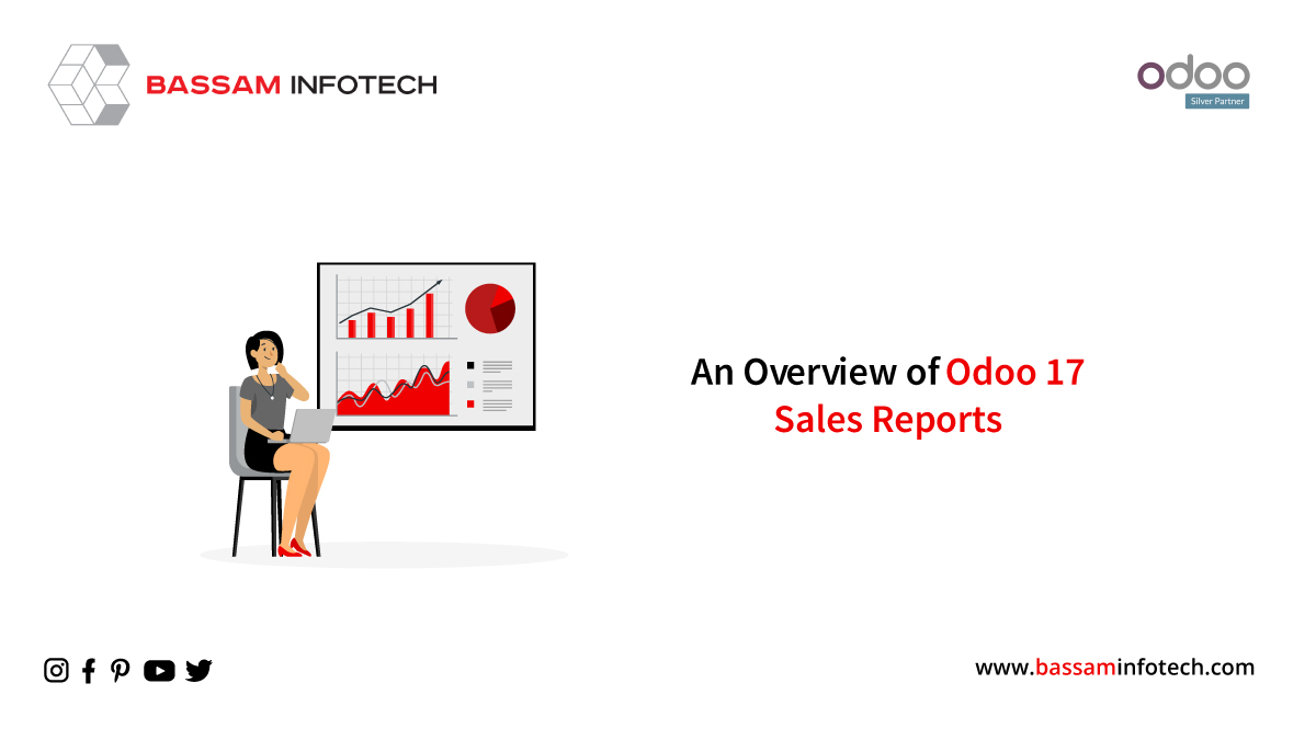
Reporting on sales operations and strategies is an essential part of every business’s sales operations and strategies. In this way, the business can determine success and expand its operations based on the latest data collected at each stage of the sales process. Odoo 17 ERP system creates sales reports quickly so you can analyze current sales performance and pinpoint areas for improvement. In Odoo’s 17th version of the ERP package, many new features and functionalities have been added.
Reporting in Odoo 17 sales
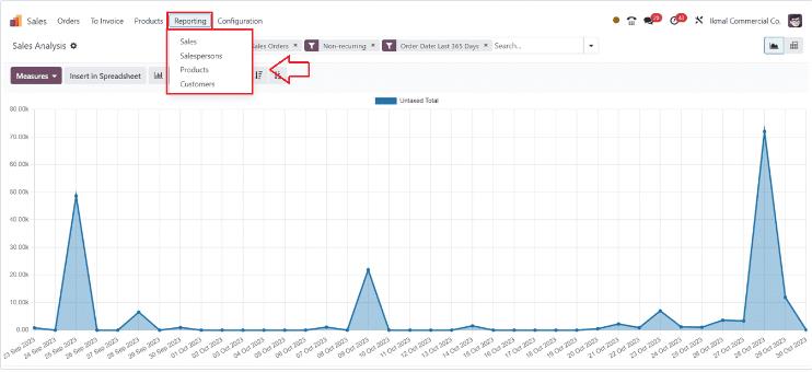
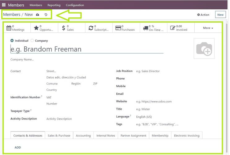
To get an analysis of all your sales-related topics, including Sales, Salespeople, Products, and Customers, open the Odoo 17 Sales Module in your Odoo ERP Package. From the “Reporting” menu, choose “Sales Performance Report” to analyze your performance.
Sales Reporting
On the “Reporting” screen, under the “Sales” section, a graphically represented monthly breakdown of sales revenues is presented. Different Order Dates are shown on the X-axis, while the sales amount is shown on the Y-axis.
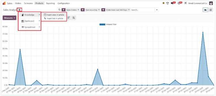
With the Knowledge Module’s integration feature, we can create articles, notes, or any type of documents relating to the report data, as well as add data to Dashboards and Spreadsheets via the action menu.
By clicking the “Measures” button, you can modify the report view parameters. There are several parameters that you can view: the Total, the Untaxed Amount Invoiced, the Discount Percentage, the Gross Weight, the Margin, the Quantity Delivered, the Quantity Invoiced, the Quantity Ordered, and the Quantity to Delivery.
You can sort, group, and filter the data in the report using the search bar at the top of the page.
“Add Custom Filter” and “Add Custom Group” buttons on the search bar allow you to customize filters and groups. Reports can be displayed as Bar Charts, Line Charts, Pie Charts, Stacked Charts, Cumulative Charts, or Descending Charts. Use the respective icons on the reporting page to display the report as a pivotal chart.
Salespersons Report
The “Salespeople” report window provides sales analyses by salespersons based on their sales performance. In the Y-axis, we can quickly understand the total untaxed sales amount, whereas in the X-axis we can see the details of the salesperson.
A similar option is also provided under the “Measures” button for modifying the graphical measures. Using the “Filter” section of the search bar will allow you to filter your results based on your preferences. Grouping the report’s data using “Group By” allows users to organize it into distinct groups. The “Favourites” section also allows you to mark data. Search bars can also be customized to create customized filters and groups. With the respective icons provided at the top of the window, you can change the Bar chart view into various other views. From the screenshot below, you can see the window’s Pie Chart.
Products Report
Understanding which items are slow-moving and which are the top sellers may be facilitated by analyzing the sales data from a sales company. Insights like these can be used to develop effective sales techniques and focus on specific products. Using Odoo 17, the “Products” reporting window shows sales analysis by product as a pie chart.
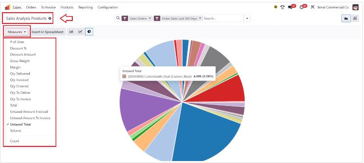
Inside the pie chart view, this amount can be seen in detail for each product. In the “Measures” area, you can view various graphical measures that provide in-depth sales data based on a variety of factors. Spreadsheets contain reporting data that can be viewed using the “Insert in Spreadsheet” button. Data can be filtered, grouped, and marked as favorites using the search bar. There are several options available under the “Action” menu, including “Knowledge,” “Spreadsheets,” and “Dashboards.” Articles can be created, notes taken, and other documentation can be created based on the “Knowledge” option.
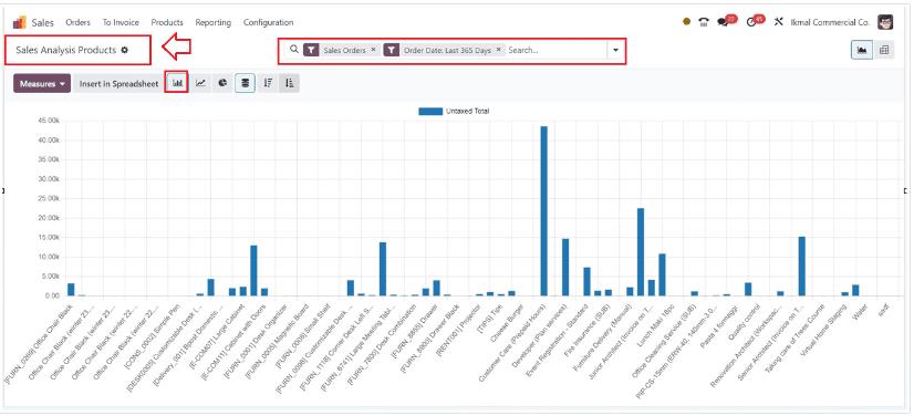
With the “Spreadsheet” and “Dashboard” options, you can also add these data to spreadsheets and dashboards. Filter, group, and favorite your favorite data using the advanced search bar. There are various visualization types, including Bar Charts, Line Charts, Stacked Charts, Pivot Charts, and other graphical displays. Depending on the user’s requirements, reports can be viewed and analyzed in different ways. In the following image, you can see the reporting window in Stack mode.
Customers Report
A Sales analysis by the customer report provides a detailed breakdown of your business’ sales by customer as well as an analysis of every client’s purchase amount. Choosing the “Customers” menu option under the “Reporting” tab will provide you with this report.
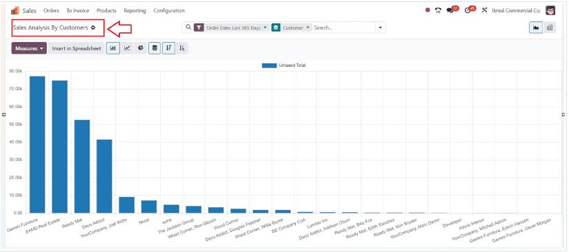
Customers’ details can be found on the X-axis, while their sales amount is shown on the Y-axis. There is a variety of graphical metrics available in the “Measures” section that can be used as a basis for further analysis. To create documentation and future records, you can click the “Insert into Spreadsheet” button which will open a spreadsheet. Create articles and add data to spreadsheets or dashboards using the “Action” menu’s “Knowledge,” “Spreadsheets,” and “Dashboards” tools. To meet your specific requirements and sales objectives, you can customize report views.
"Unlock the Full Potential of Your Business with Odoo ERP!"
"Get a Cost Estimate for Your ERP Project, Absolutely FREE!"
Get a Free Quote